Creating the NY-NJ-CT Map
Sept 2023
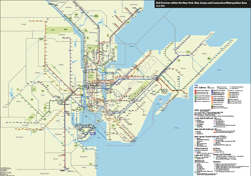
Subway, PATH, Regional Rail, Intercity Rail, Ferries, Key Bus Routes, Light Rail and Tramway
Something different
After completing the London Metro Area Map, I wanted to turn my attention to an area without something most major cities have. Both of the maps I’ve already made, did have something unique. In the case of Iberia, no route map seemed to exist, and for London, no map with step free access for all rail stations, or combining river services with rail in existed.
Until now, as far as I’m aware, no map of combined modes of public transport in New York-New Jersey-Connecticut existed, despite some talks of one being created.
Design Goals
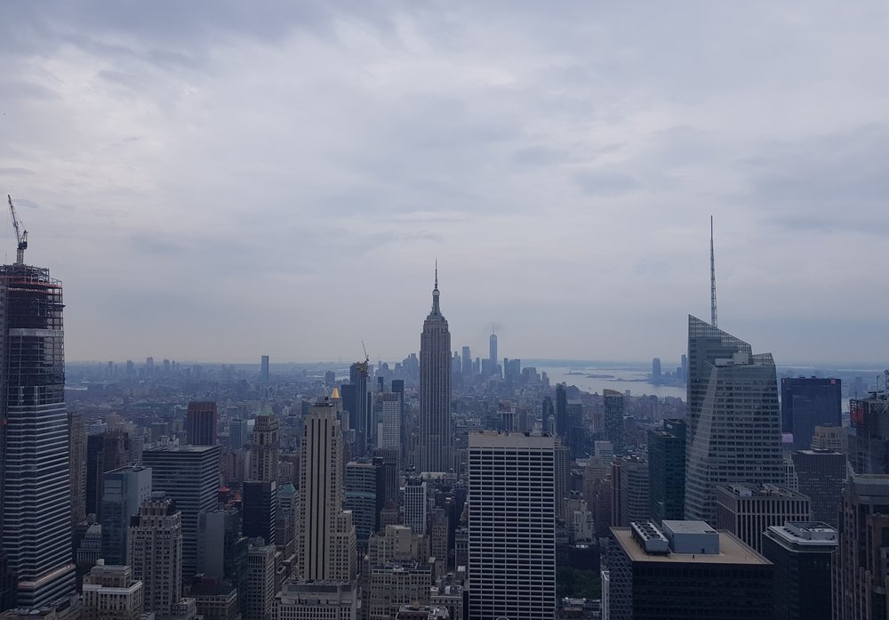
I knew from the beginning this would more difficult than eating a big apple! (maybe not for me, I’m allergic). Having only visited New York City once, the Metro Area’s transport system can be difficult to get your head around. Yes, we all know there’s the iconic Subway, but NYC’s is very unique in the way it works, and that’s before mentioning in the rail network.
Being from the United Kingdom, rail mapping is something we take seriously – we did create railways and metro systems after all. Understanding the New York Subway with a London or European transport hat on takes a minute; express trains and one line colour with different route names isn’t something you tend to see on other metro systems. Add in the geographical nature of most US maps and the complexity can be mind boggling. However, these similarities are something seen in Nottingham’s bus system for example; bus routes on each corridor using a one particular colour – Green being bus routes for West Bridgford; Aqua for Mapperley; Navy for Clifton, etc. Having studied in the city, such methods of mapping suddenly became clearer to me.
But I digress… in drawing this map I wanted to achieve some things:
- Include Subway, PATH, Railroad, Light Rail and some Ferry services to show the ease of using public transport, especially in the US, a country that’s often sceptical of public transport
- Not to overly distort the geographical nature of US maps
- Ensure clarity, make it easy for a tourist to understand
Before every project, I do some background research – looking at the official and unofficial maps to see what’s already done, how could they be improved and how they can be integrated. Info on maps can always be integrated, it’s just ‘how’ what’s difficult.
The Beginning
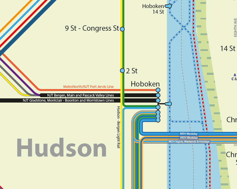
I started drawing in December 2022, feeling unsure on the exact design style I wanted. I’m not sure how other map designers decide to start, but I pick a random place pictured in my head and go from there. For London, I chose Chingford, for this, Hoboken.
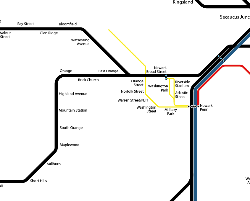
I had first planned to show rail services as thick lines, similar to London. I roughly drew the NJT Railroad as thick black lines, however, I didn’t like the look and, with all three Regional Rail (Suburban Rail) services naming their routes, it didn’t feel appropriate and it also failed the clarity aspect.
Regional Rail lines
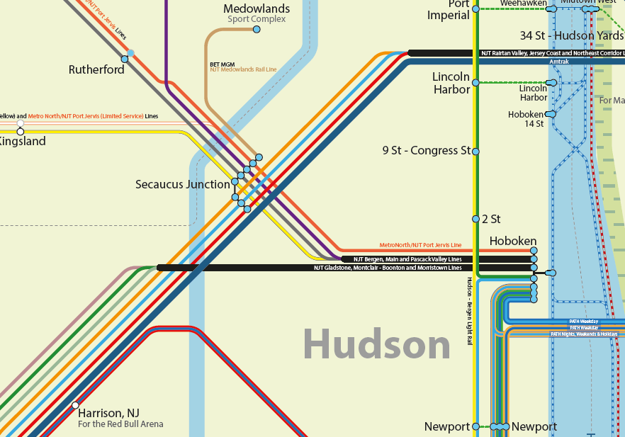
Deciding against thick lines for each regional rail branch, I now confined this to the approaches of each main termini, using thin lines, coloured as per their official designation. For Amtrak however, I use a thick blue line throughout, symbolising the multiple services it offers on the North East Corridor and Hudson Line.
The same principle of thin lines for regional rail has also been used for the light rail services. For PATH however, despite its official designation as a rail service, it acts as a Metro, therefore I show it in a similar way the Subway.
Subway + PATH
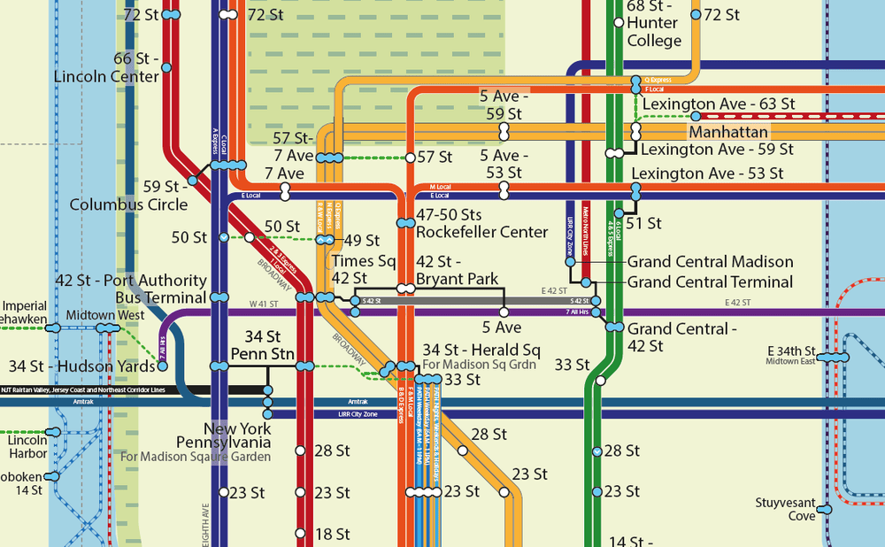
Subway and PATH services are exclusively shown as thicker lines. This sets the services apart from the branches of the railroad services, and suggests a higher frequencies.
Subway corridors have been conglomerated into separate Local and Express services.
Subway line labels
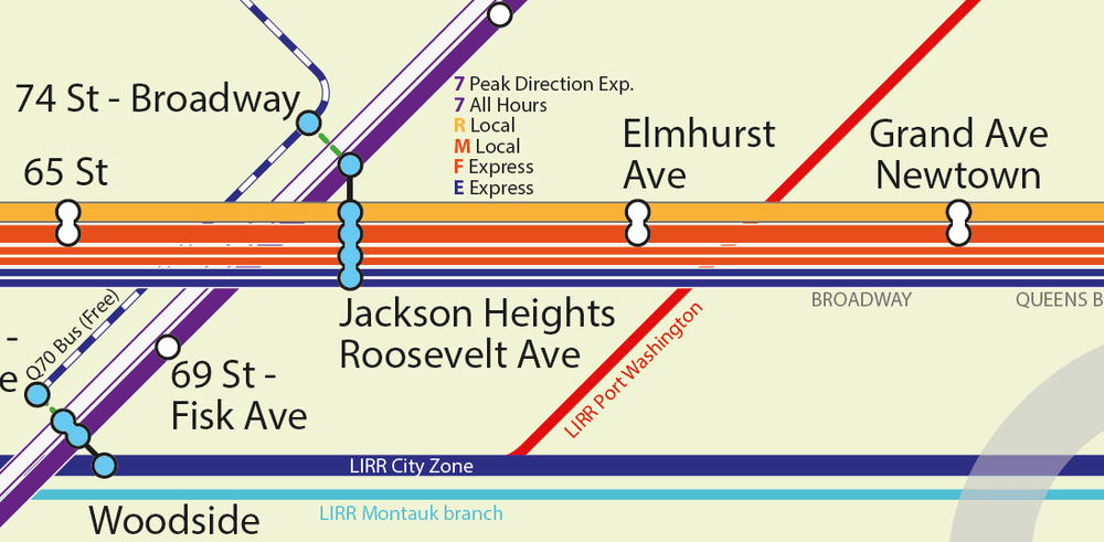
Originally for the Subway, I placed line names inside the service route (fig. 5). However, this was too small to read, even slightly zoomed out. So I moved Subway names to the outside.
This caused another issue. Subway services on this map are shown as either Express or Local, however, it wasn’t obvious which was Express or Local at first glance, and was even less clear with the line labels on the outside. Therefore, I added a white stripe for Express trains. Now I think it’s clearer in the pic above – M Local train, F Express train.
Geography matters
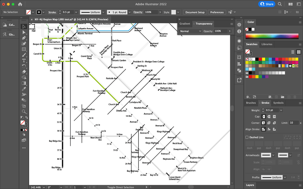
Being the New York area, geographical location is important for stations. The grid system is king in New York. Drawing this map, I quickly begun to understand just how important this is for New Yorkers and therefore it’s essential for the map to respect this culture.
Therefore, I see aligning stations serving the same road, as vital. Not only the operation of the Subway unique, but New York is quite unusual for having a medley of examples of multiple stations with the exact same name. Whether it’s 23rd St in Manhattan or King’s Highway, in Brooklyn, aligning stations and adding the road corridor name makes it simpler to know which one to use.
Staten Island
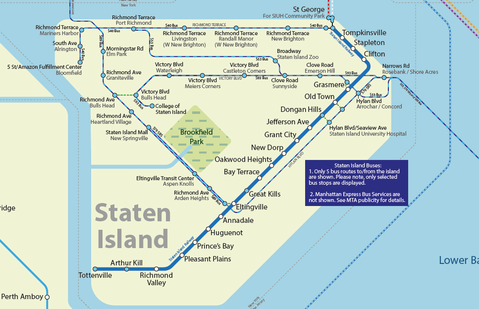
On the island, I had originally planned to only show the Staten Island Railway, however, the SIR only covers the east side of the island and doesn’t connect to any other borough or state. Being a map designed to highlight the ease of public transport, I decided to do two things: A) add ferry connections; and B) add bus links.
Forgetting ferries for a moment, local buses provide mobility around the island, and add vital cross water links. I’ve added some key routes, connecting stations in both Brooklyn and Hudson.
Each station point on the island is more of an indication of the area it serves, rather a specific bus stop.
Ferry routes
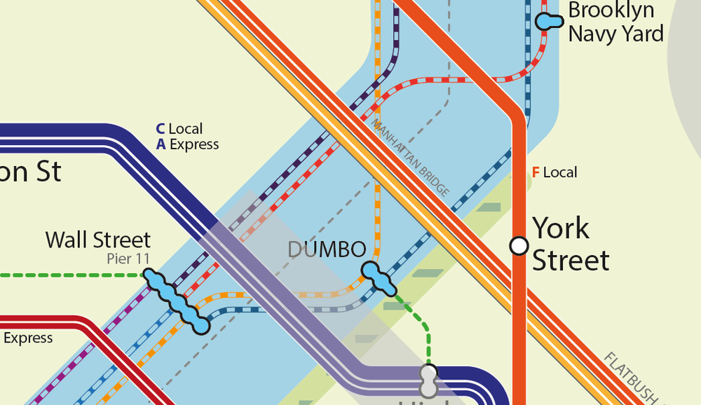
Like London, I wanted to add ferry routes. Ferries outside of Sydney are often overlooked, or considered to be a thing for tourists, not for locals. New York City is a bit of both – the Staten Island ferry is an essential part of the transport network, while the link to Liberty Island is also essential.
Here, ferry routes are shown as thin dashed (but encased) lines.
Stations
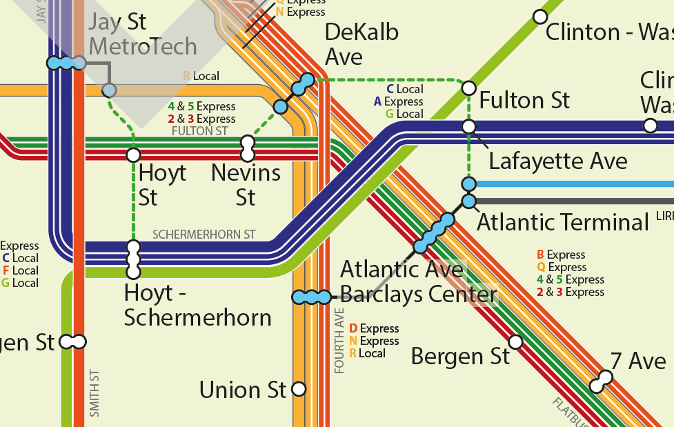
Unlike other NY maps, I use the station points for accessibility information. Blue = having step free access to platforms. White = not step free.
I also make great use of intra-station interchanges, linking stations within walking distance of each other (less ~5mins) with a green dashed line. Out of Station Interchanges (OSI) as they’re known in London, can be great for shortening journeys, giving options passengers are often not aware of.
Atlantic Terminal is very well connected to the Subway, it does seem odd to me that the LIRR doesn’t make greater use of this route. Especially with easy access to Wall Street.
I hope you like this map! Will update this map soon, with tweeks and general updates.


Leave a Reply