Mappingford
A New Map for London
This page is being kept for archive purposes.
September 2023
City:
London
Last updated:
September 2023
Design Goals
The earliest combined Rail and Underground map I can find is the 1986 London
Connections map. Allowing for privatisation and updates, this basically stayed
the same until around 2011, when the final copy was issued, replaced with the
‘Rail and Tube Services Map’. Similar maps to this were already available,
showing all National Rail routes simply as white with black borders.
I’ve always preferred the original London Connections map and if you’re
familiar with it you’ll see where I’ve taken some inspiration. For example,
with the insistence on having the Great Eastern and LTS/District Lines
horizontal, in an Easterly direction, rather than a North Easterly direction.
With many other things which I think could be better, including adding
station accessibility info for all stations, I embarked on drawing my own
version.
Deciding to draw London I wanted to achieve several things:
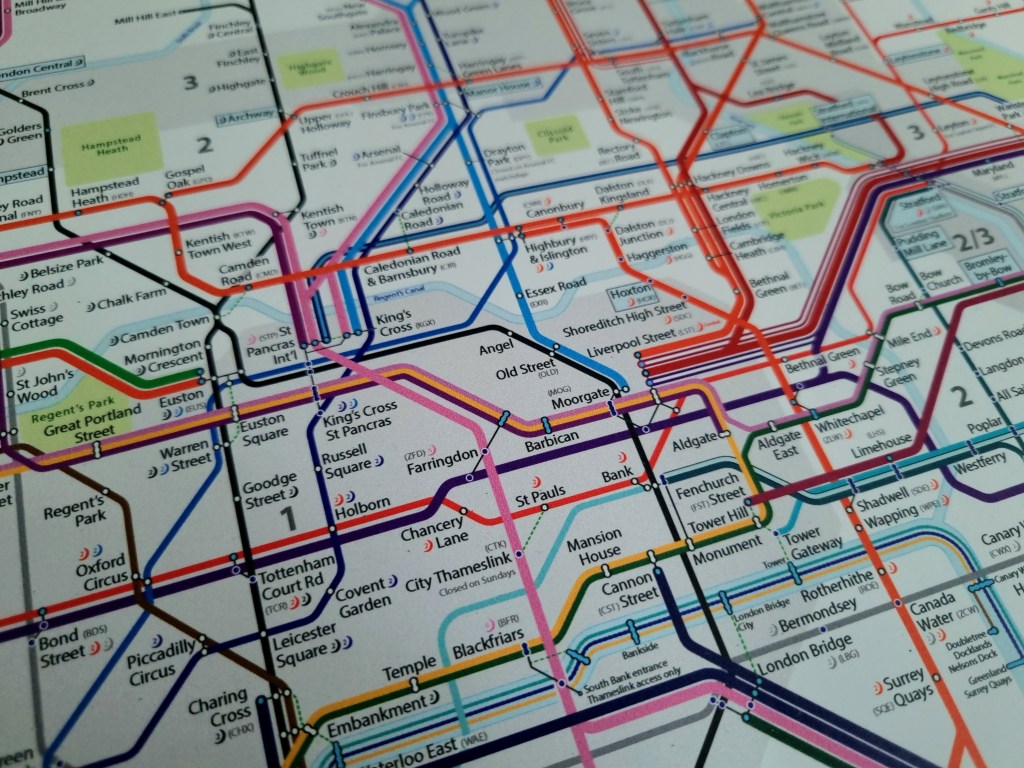
- Farringdon – clean, prominent London RER Hub
- Display Station Accessibility & Codes
- Promote Waterways
- Promote Overnight Services
- Individual DLR & Tramlink Routes
- Biblical Accuracy
- More Info, But Clearer
- Close Enfield Chase – Town Gap
- Include Greenspaces and Waterways
The beginning
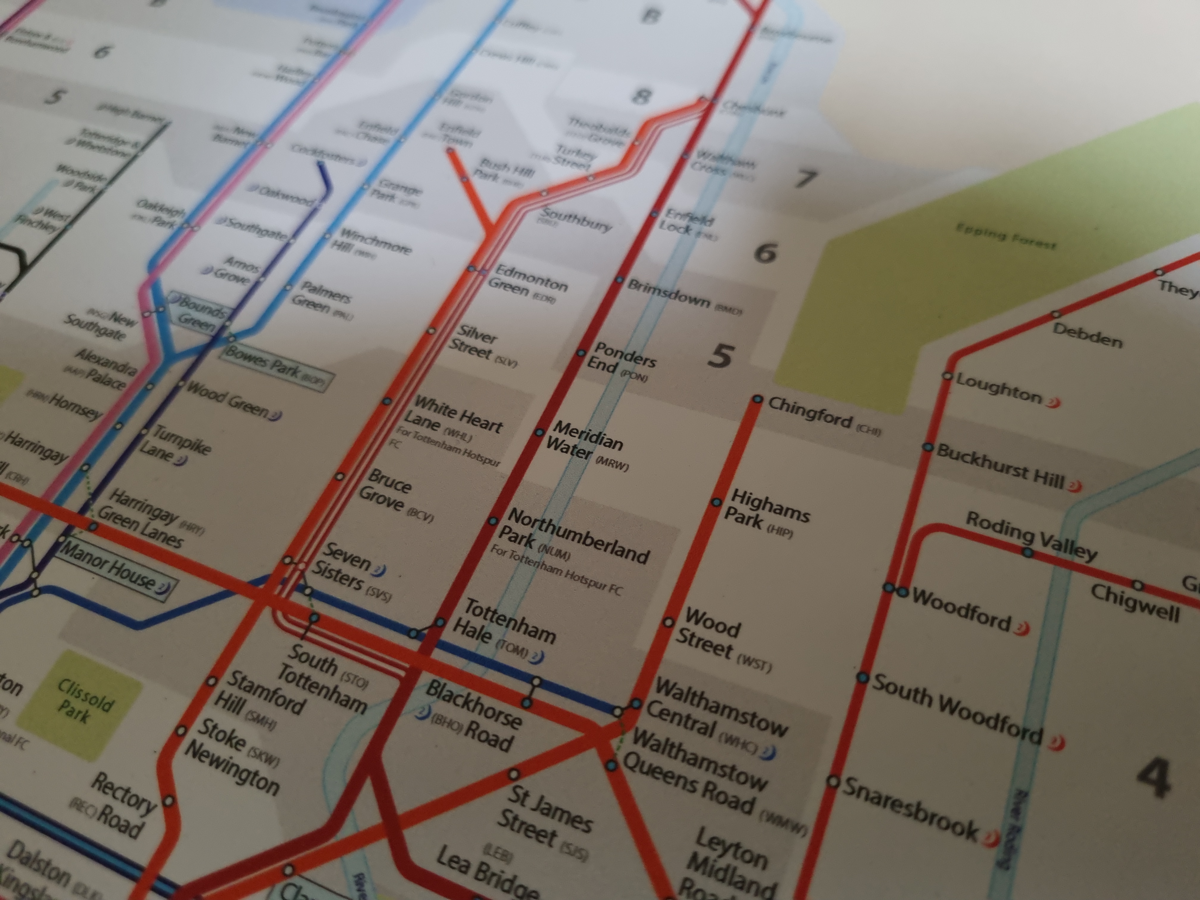
But before this, I had to decide on the design style. This took a while; I knew I wanted a modern, ‘soft’ style, but in-keeping with London’s colours, adding some features including parks and waterways. Île-de-France (Paris Metro Area) has a nice balance, but I wanted thicker lines overall and a less cramped city centre.
At this point, I already had drawn my first version of the Iberian High Speed map, but didn’t think the style was quite right. After thinking about it for a few days, a mental picture of how I wanted the Chingford branch begun to form and I ran with it from there, developing the style as I went (yes, I didn’t do a rough copy, I just drew).
Farringdon, the hub of London’s RER
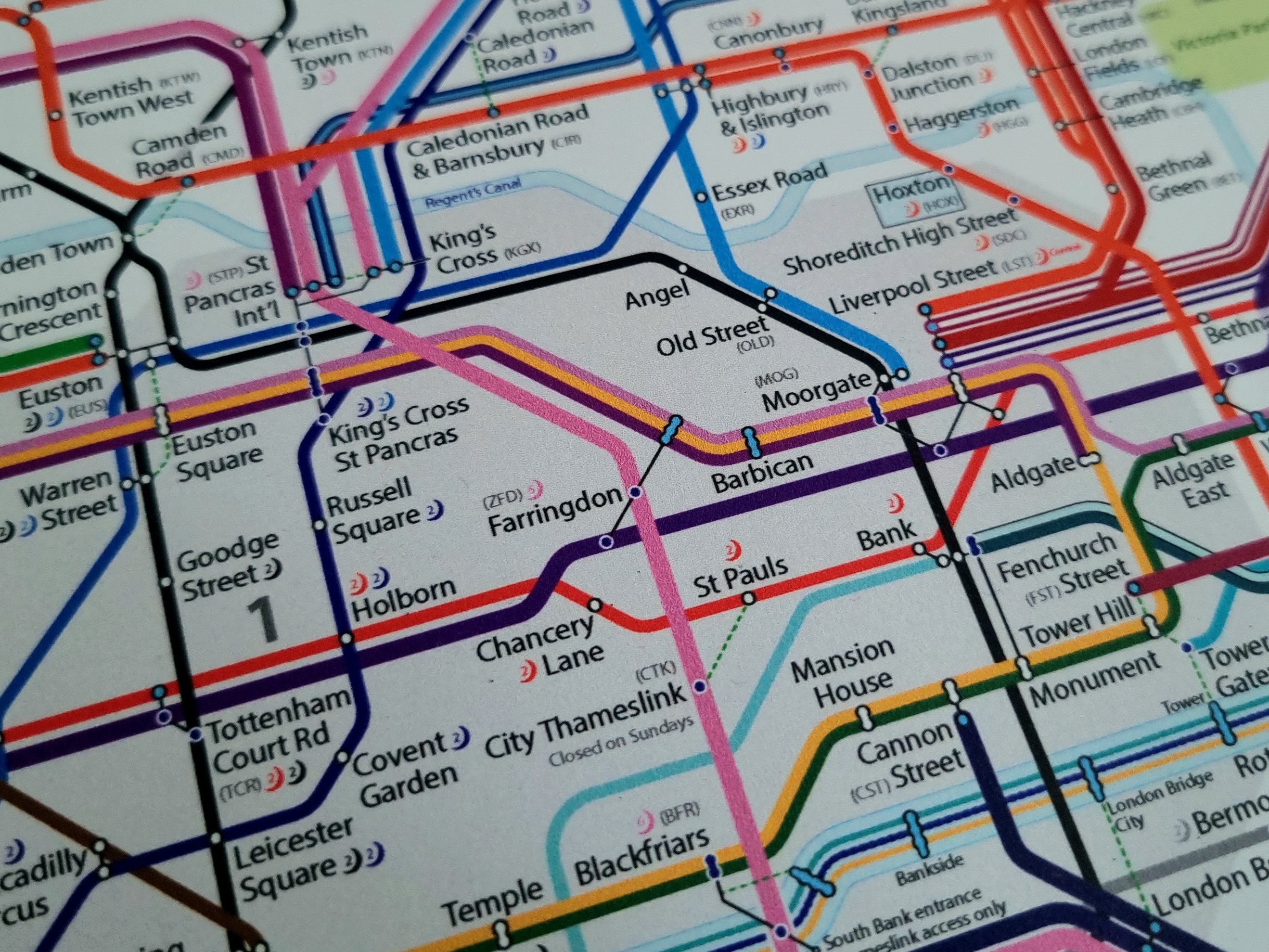
The formally rather quiet (for Central London standards) Farringdon, has since 2022, found itself at the centre of London’s rail network. With the opening of the Elizabeth Line meeting Thameslink at Farringdon, the station is suddenly one of the most important stations in London. Being the centre of London’s cross-city routes, it was vital for Farringdon to stand out cleanly, on two straight thick routes.
I wasn’t happy with the initial drawing, thinking I failed in the aim for Farringdon to stand out, cleanly. After redrawing for an updated edition, I’m now particularly proud of the relative straightness of the Liz Line here – it almost tells the passenger it’s an express service.
Station Information
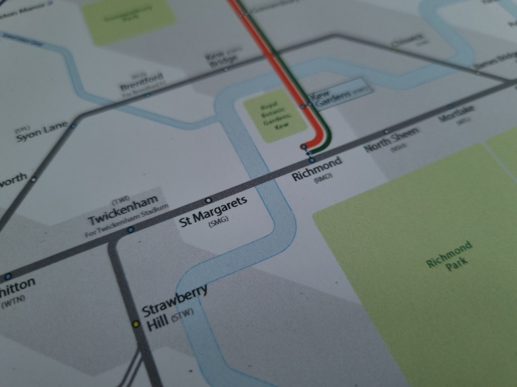
For a long time now, TfL has shown station accessibility info for all stations on the Tube Map, however for the combined Rail & Tube map, this isn’t shown. Not only does this give poorer understanding of accessibility information for London’s non-TfL / Thameslink stations, but also disadvantages South London which is heavily dependent on non-TfL Rail services. This had to change, and is an example of something rather simple, which can be improved without the need for devolution. Station accessibility, whether it be Walthamstow Central or Wallington, it should be very easy to find out.
I’ve broadly used TfL standards for this, but with the addition of one extra category:
– Dark Blue = Step Free, Level Access
– Light Blue = Step Free – Street to Platform
– Light Green = Step Free, but may need assistance due to steep ramp
– White = No Step Free Access
Interesting to note how routes such as Stratford – Stansted, have all 18 stations boasting step-free access, but only one of the fourteen stations between Finsbury Park and Stevenage via Hertford North can relate.
Codes
All 2,575 railway stations in Great Britain have a three letter code. You can use them for tickets, looking up train times and stations themselves, yet they’re hardly used. Most rail maps in the UK do not show them, and they’re not included on any signs, although often appear on ticketing websites. Spreading the knowledge of station codes may not be useful for the occasional rail user, but regular users could save a few seconds for a quick check of train times – something I need to do very quickly regularly.
I have thought about added car parking information, but I have decided not to.
Promoting Waterways
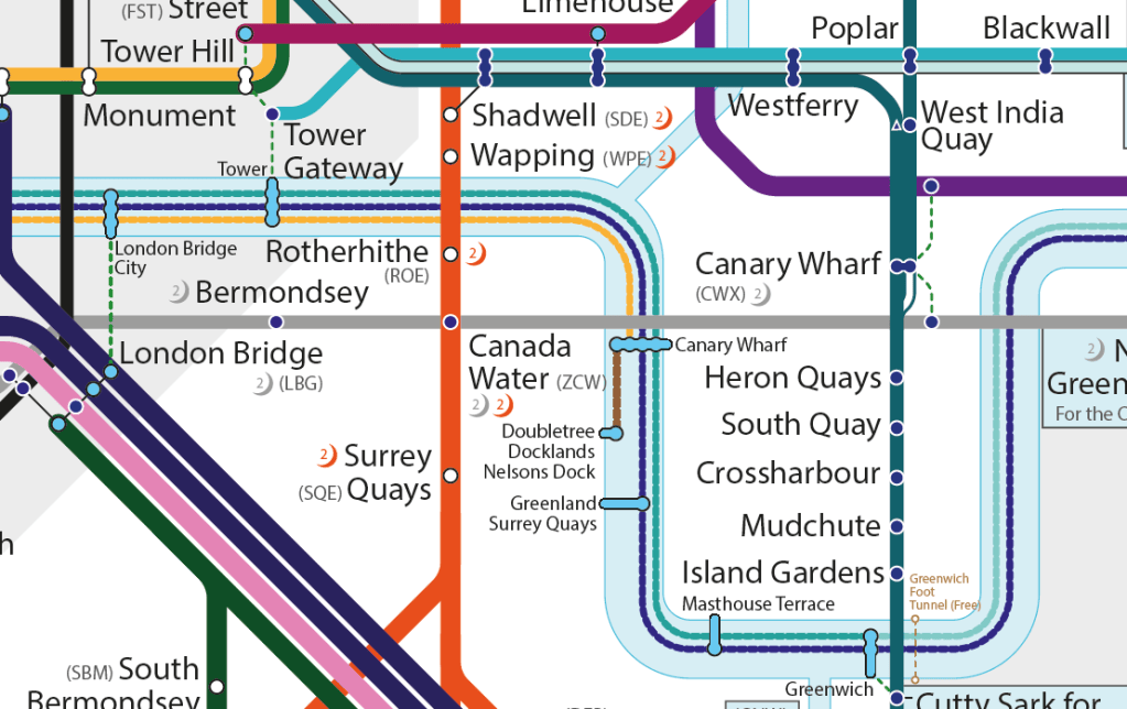
One thing I’ve always said about London’s environment, is that rivers are forgotten. Many were built over and turned into sewers. Of the rivers we have left, many are often full littered with rubbish or surrounded by concrete. To promote our waterways, I’ve added our canals and rivers; our canals have walkways and showing our rail and waterway interaction, can only promote usage of both.
Turning to the Thames, Ferry services are often not well promoted either. While Ferry Piers now appear on Tube Maps, the routes aren’t and I believe the usage has suffered as a result. It’s taken 20 years for the Thames Clippers to reach its 40 millionth passenger – the new Elizabeth Line did that in just 2 months. The ‘Tube Map effect’ is powerful – it promotes routes, but also reminds you of the option.
Furthermore, I’ve also included the Greenwich and Woolwich Foot Tunnels – two free foot crossings, under the Thames – a good alternative if you wish to walk, something I often do after or before taking the DLR for an onward journey. A third Foot Tunnel (the oldest) also existed – Brunel’s ‘Thames Tunnel’, now forms part of the Overground’s East London Line.
Overnight Services
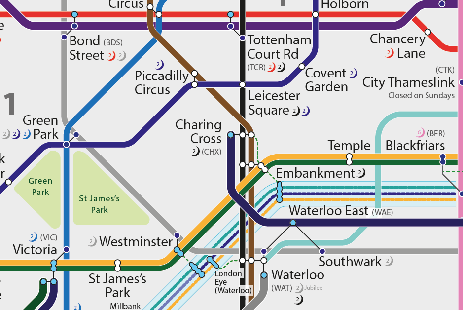
Another important feature is overnight services. Currently, there isn’t a map of all overnight services in London. Since the Night Tube started on Fri-Sat nights in August 2016, there has been a Night Tube Map, showing the overnight Tube and Overground routes. However, despite being on the day map, it misses out the 24 hour (Mon-Sat) Thameslink route in its entirety, even missing the interchange symbols. Thameslink operates hourly overnight between Bedford and Three Bridges, giving Londoners 24 hour access to both Gatwick and Luton Airports. But, while its night services are busy, it must be said, Thameslink make a very little deal out of its overnight services. In fact, you wouldn’t know unless you consult the timetables.
Initially, I wanted to use an Awl, akin to TfL’s to designate overnight routes. However, I decided against this. Instead, I use crescent moons, with a number in them – ‘2’ = Two Nights per week (Fri-Sat), ‘6’ = Six Nights per week (Mon-Sat). A simple system that can easily expand.
Including this information also reveals, just how little of the South side of the river is accessible by rail transport at night. In South London, we heavily rely on Night Buses and Taxis past midnight; just 26 stations in the South side of London have overnight services at least two days per week. This isn’t helped by Thameslink running non-stop through South London between London Blackfriars and East Croydon, and Network Rail considering it a necessity to always have overnight shutdowns.
DLR & Tramlink Service Routes
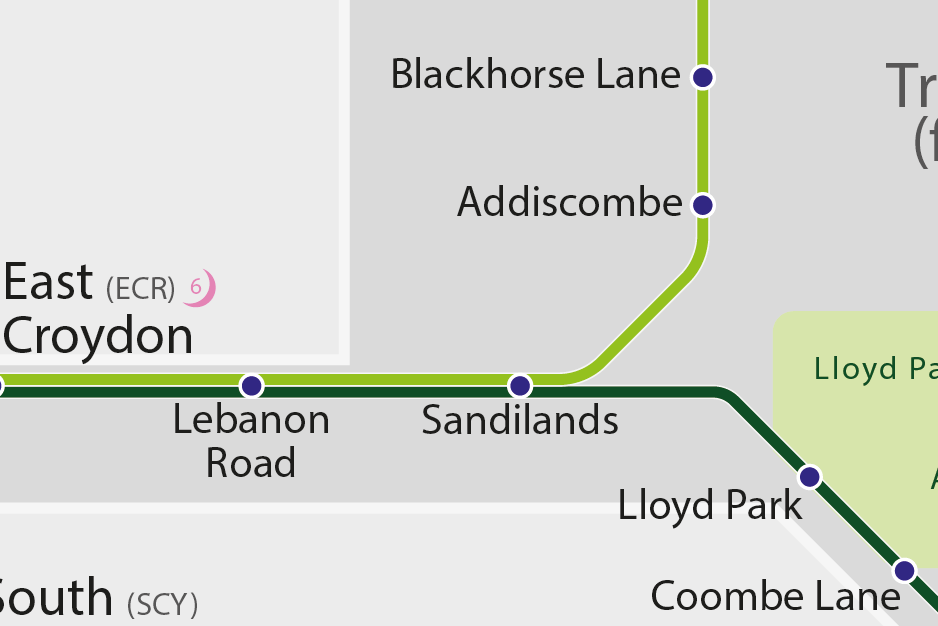
Both the Docklands Light Railway (DLR) and Tramlink, have their own designated routes. The DLR with three; Tramlink with two. These networks both show their individual routes on maps exclusively for the network; at stops/stations, onboard the trains, but never on maps showing other modes of transport. The colours used on my map are similar to the official, designed to make it clear which route can be accessed from where. Wimbledon to Lloyd Park requires a change at Sandilands for example.
Arguably, this is more confusing than London Overground routes. While the Overground doesn’t have (widely known) individual named and coloured routes, the lack of through services between lines are shown on all maps.
Accuracy
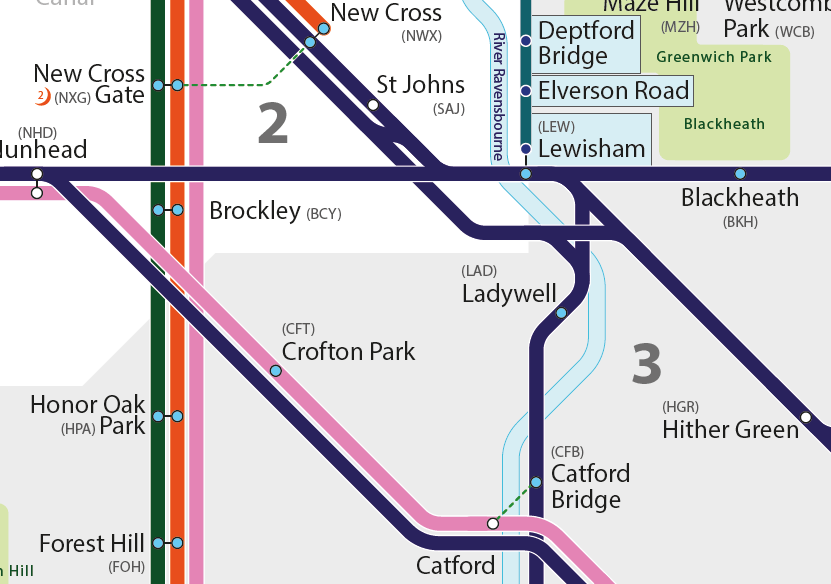
It’s often said fewer lines can make a map simpler. i.e. have one route through St Johns and axe the Lewisham bypass, and people will just work it out. I disagree. As long as it’s shown clearly, more information can be useful. Here we show only Cannon Street services serve New Cross, St Johns and the Greenwich Line, while only Charing Cross services can bypass Lewisham.
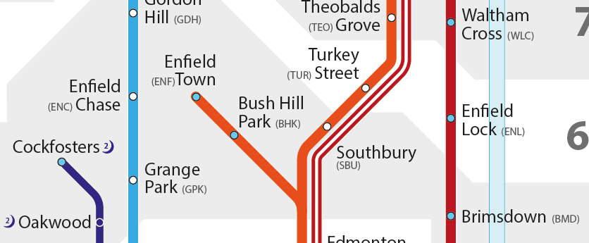
Geographical accuracy is also of some importance. While this isn’t an OS style map, stations need to reasonably reflect the location they’re located. On the official map, Enfield Chase and Enfield Town are shown far away from each other, and Hayes (Bromley) is close to Addiscombe. In reality, the Enfields are only 0.6km away from each other on the same road, while Hayes (Bromley) is directly south of Bromley.
In addition, I wanted geographical accuracy for routes crossing each other. A petty pet peeve of mine is Brockley. The Catford Loop line separately crosses the Brighton Main Line south of Brockley (image 6), rather than north of Brockley on the Lewisham Link Line as shown on the official map. Having said this, Hounslow is much harder to achieve, and has been shown relatively far from Hounslow Central, however they are 1km apart.
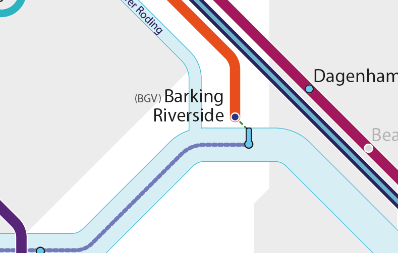
I’ve also included stations planned or under construction:
- Beam Park (c2c)
- Brent Cross West (Thameslink)
- Old Oak Common (Elizabeth Line, GWR, HS2)
- Surrey Canal (London Overground)
- Barking Riverside (London Overground; now open)
Grey Notes
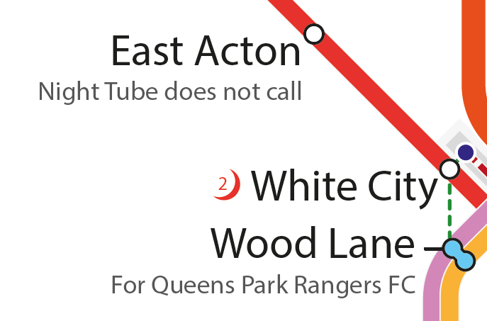
Sometimes a little bit of extra information is handy. This is where I’ve added grey notes.
The notes give the passenger useful information such as being closed on Sundays (City Thameslink) or the Night Tube skipping the station (East Acton).
More widely, the notes also inform about the local stadia and arenas across the Metro Area. This includes football teams such as Chelsea (Fulham Bway) and Leyton Orient (Leyton); Rugby (Twickenham), Tennis (Wimbledon), Horses (Ascot; Tattenham Corner); and arenas such as The O2 (North Greenwich).
Summer 2023 update
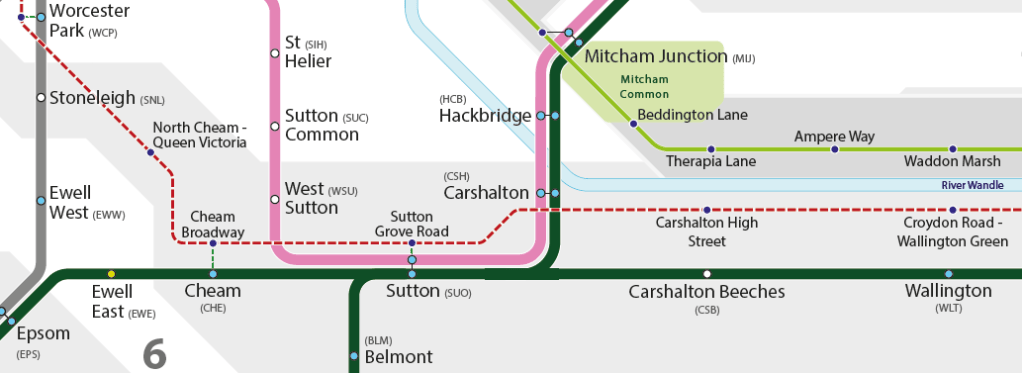
With the announcement of Superloop, I decided to add the routes to see if it’d be valuable for Londoners. These express routes provide useful corridors, especially for the Outer London suburbs where rail isn’t an option. Routes will be added progressively as they start
Routes are also now encased in white to make the routes clearer and neater
Further Info
This map will continue to be updated. I will also publish a fantasy map for London soon enough.
Download
August 2023 – Rail & River Services in London’s Metropolitan Area




Leave a Reply